flying sparks ein Weblog von Tobias Jordans zu den Themen software designstudium web2.0 webdesign informationsdesign oekologie werbung usability tj video interfacedesign marketing // alle Themen...

Alle Funken für das Thema design:

Mozilla Labs Design Challenge: 5 of 5 Designs fail

Mozilla Labs just asked everyone to vote for their favorite concept of the new home tab.

This is the last step of the Mozilla Labs Design Challenge in which users where asked to illustrate their ideas of the Hometab (Read more about it).

You may have a look at the 5 results after you added your eMail-Address to register yourself for voting.

This is why I am writing about it: I am sorry to say it but in my opinion all five designs fail to show a good, easy, usable concept for the hometab. I am sure everyone who contributed spend some time on their ideas (and the video they created for it) and that is a great contribution to the community (thanks!).

But from a UX and usability point of view those designs don't show a solution. Instead they are great examples of how to clutter an interface with tons of features and loose all simplicity in this process.

At least I dont see my hometab as a dashboard of widgets that show and pull tons of information on a small space, as one contribution suggested. If you want this, make your Netvibes Page or iGoogle Page your homepage. Or add yourself a weather-widget to you operation system. Dont look at the hometab as if there where no OS, Widgets and Apps around your browser. At least not until Chrome OS rules us all.

And I dont want it to be a copy of my social networks as well. I have my Tweet-App, Newsreader and all the other good apps for that. None of those apps could be as good as the apps that are already out there for years with their own community an user base. Try using Flock „the social browser" that no one uses.

And I dont want a hometab that changes every time I visit a website. Even Microsoft got it know that formulas that try to adapt to users behavior are much less effective than a UI that reinforces habits. When I am used to seeing my facebook-link at the bottom of the list I will find it there without thinking. Dont move everything around just because I use it.

That being said I voted with one 1 and four 0 on the challenge and hope, the UI-experts at mozilla will take over from here.

Its will be interesting to see if this kind of open source design will produce any mentionable results in the future. And how this design challenge will influence the community-process.

Warum Geeks die MacBook-Air-Verkäufe unterschätzten

Ein tolles Zitat von Terry Sutton:

Geeks have a tendency to drastically overestimate the value of extendability, number of ports, and benchmarks while drastically underestimate the value of design, feel, and convenience as perceived by regular people. This would seem a case in point.

Zum Hintergrund erklärt er kurz zuvor:

„The MacBook Air has been the top selling Mac since before the middle of February, outselling the MacBook, the iMac, and the MacBook Pro—this, despite week-long shipping delays."

[tags]Hardware, Design, Produktdesign, User Experience[/tags]

LinkedIn in neuem Design

LinkedIn ist bisher durch sein ungewöhnliches Navigationskonzept aufgefallen. Ich hatte sie gedanklich eingeordnet unter den Seiten, die primär versuchen über den Content zu navigieren und statt einem einheitlichem Raster, jede Seite speziell für ihren Anwendungszweck optimiert zu gestalten.

Das hat meiner Meinung nach bisher nur mäßig gut funktioniert — jedenfalls habe ich mich nie so gut zurechtgefunden wie beispielsweise bei XING.

Das könnte jetzt vorbei sein, denn wie ich lese, hat LinkedIn sein Design komplett umgestellt.

Jetzt ärgere ich mich natürlich, dass ich zuvor nicht noch ein paar Screenshots davon gemacht habe, um jetzt beides gegenüberstellen zu können. Bis zu einem gewissen Grad kann man das bei Flickr nachholen.

Macht euch selbst ein Bild: www.linkedin.com

[tags]Webapplikation, Interfacedesign, Redesign, Design, Socialnetwork[/tags]

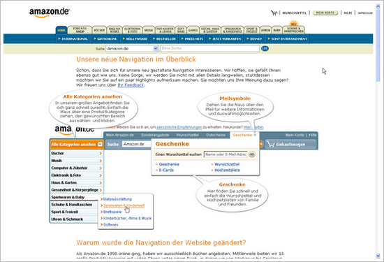
Amazon in neuem Design… oder doch nicht?

Sonntag habe ich kurz ein neues Design auf amazon.de gesehen. Ein radikaler Wechsel weg von dem altbekannten Look&Feel.

Kurz darauf war es jedoch wieder abgeschaltet. Nur diese Info-Seite zur neuen Navigation von Amazon selbst ist übrig.

Ich wünschte wirklich, es gäbe ein amazon-Entwickler-Blog in dem sie im Jensen-Harris-Style über den Prozess berichten :-).

neues amazon.de design

[thx@kon für den Link]

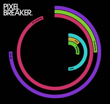
radiale Zeit

Eine schöne Visualisierung:

pixel breaker


[tags]zeit, datensicht, visualisierung, design, flash[/tags]

Fotosammlung mit neuen Blickwinkeln

Tim hat mich auf diese tolle Sammlung von Fotos aufmerksam gemacht, alle die sehr schön mit der Betrachter-Erwartung spielen:

haha.nu haha.nu haha.nu mehr…

Kurz: Photoshop CS3-Videos

Bei Galileo Design gibt es 5 Videos zur neuen Photoshop CS3-Version. Eine praktische Einführung in die Neuerung — einige davon gute Interfaceverbesserung.

[tag]adobe, photoshop, grafikdesign, design, webdesign, fotografie, interface, interfacedesign[/tag]